How this site was built
I rebuilt my entire portfolio with Claude Opus 5.5, on medium effort. With this post I want to show that today anyone can make things with AI, and that you don't need complex prompts. You need creativity, and a critical eye for what the AI gives back.
So here are the exact prompts I used, the way I talk, and how I get to a result that isn't the usual one.
I sent 88 messages. About a third of them said some version of "no". I write in Portuguese, so every message below is translated, as close to how I wrote it as I could.
Three links and one sentence
I didn't start with a design. I started with references.
The first was adixcode.com: a bento grid where every card has its own small animation. The second was imdaryl.com, which matters more. The whole site is one idea: his portfolio is a drafting sheet, because his job is drawing interfaces. The third was my own profile on Git City, with one sentence:

The AI read Git City literally. It copied its identity, put Geist next to the pixel font, and called it a start. I said no to all of it:
So it went the other way.
Four complete homes. Tap through them.
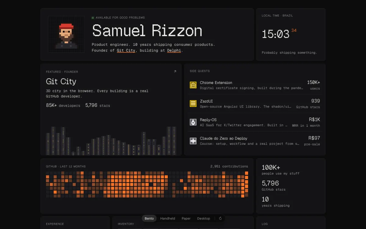
Finding the metaphor
Daryl's site has one metaphor, so mine needed one too. I took his idea and swapped in my own:
I said "like the squares of the contributions graph", and the AI drew the graph: three heroes spelling my name in its cells, nearly identical. I didn't save those.
Three different heroes this time. (All blocks has no animation: the name just appears.)
Two out of three, plus one idea
Three animations of your name: 1 Swarm, 2 Drop, 3 Print. Drop never made it into a commit, so only two are here.
This is where the site was born. Every element on the page is now built this way: text from the font's real pixels, images averaged into 8px blocks, buttons as blocks.
Too much for one agent
With one agent building the whole page, there was too much work for it. To finish in a few seconds it had to move so fast that it looked like it was playing at 3x.
The same message killed a giant "PRODUCT ENGINEER" title ("it has to be my name, but it can be smaller"). The next one killed the tagline:
The line under my name now just says what I do.
Name the content, not the layout
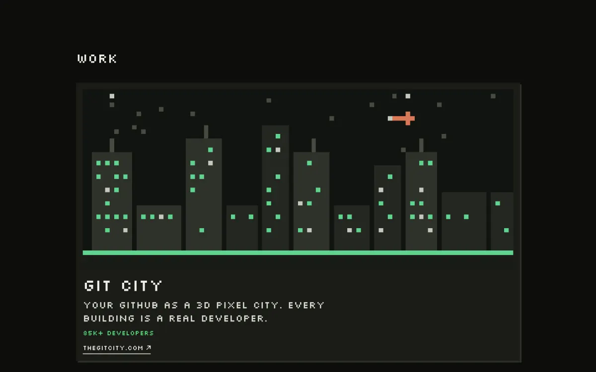
The projects section took the most rounds, around nine: four cards, a list, a list with a panel, a shorter list. I kept choosing between layouts and none of them landed.
Your projects as a list, with a preview panel the agents build when you hover.
Testing everything
The AI tested what it built, in a browser it controls. I tested like someone who doesn't know how anything works: on my phone, impatient, poking at things. A few of the bugs I sent it, as I sent them:
Test it yourself
Every one of those bugs passed the AI's own checks. It tested each change in a browser it controls, took screenshots, and told me it worked. Then I opened the site on my phone.
That's the step people skip. The AI tests the case it just built, on the screen it's using. Your visitors are on a different phone, scroll during the intro, press Esc at the wrong moment, and send the link to friends with slower devices.
So before calling anything done: open it on your phone, use it like someone who doesn't know how it works, and send it to a couple of friends. Most of what I fixed on this site came from that, not from the AI.
The tic-tac-toe one came with a second request:
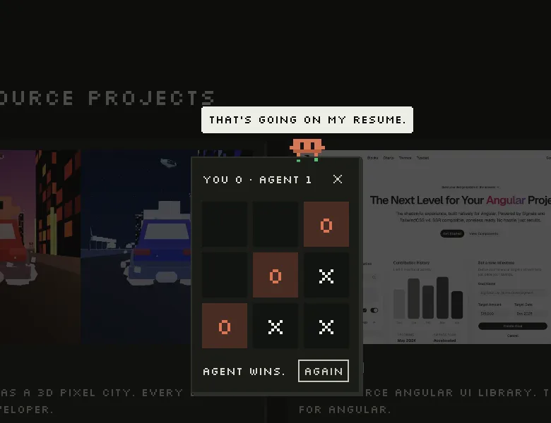
A lot of the site started as jokes like that. "It would be cool to play tic-tac-toe with him lol" became the game. "Don't you get tired?" is what the agent says once you've heard all its lines. "I love matrix" became a command.
What the site is for
At one point there was a work history section, built from bricks.
Your work history, one brick per quarter of each job.
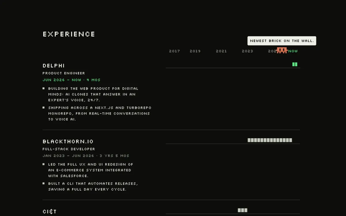
Then I said what the site was for:
That sentence removed a section and changed the contact form too. I wanted something people would play with:
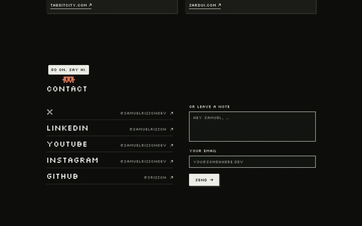
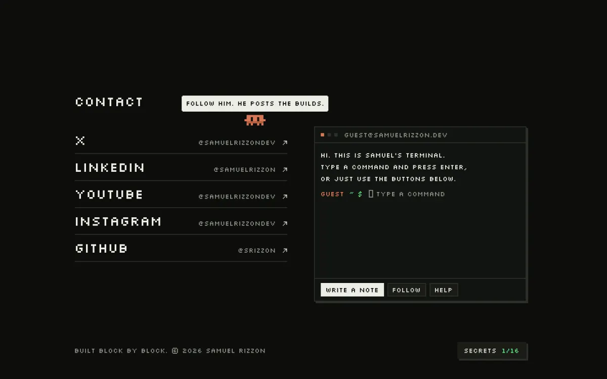 FormTerminal
It has buttons for people who've never seen a terminal, and commands for people who have.
Where the AI got it wrong
- It copied Git City instead of using it as a reference.
- It drew the GitHub graph itself when I meant building with blocks, three times over.
- It deployed every change to production because I had said "you can deploy" once. I had to ask why.
- It wrote the first draft of this post in the pixel font, as a timeline of timestamps. Both went.
None of these were hard to fix. Each one needed me to notice it.
What I'd tell someone directing an AI
- Send references, then name your own idea. The references set the level. "Everything is blocks" gave every later decision a direction.
- Describe what you see, not the code. "It looks like 3x speed" and "he doesn't take something and come back" fixed more than any technical note.
- Shrink the scope until it's one thing. "Let's take just one thing and animate it" unlocked the whole site.
- Ask for options, then react. Most of my decisions were picking from three and adding something.
- Say no fast, with a screenshot. One sentence is enough.
- Keep what you reject. It costs one commit, and this post is made of them.
- Test like a stranger, on a real phone.
Numbers
Every message I sent, one block each:
- messages I sent
- 88
- with a screenshot
- 14
- reference links
- 3
- roughly, from my first message to "the hero is approved"
- 7h
- commits in the rebuild
- 55
- lines of code I wrote
- 0
There are nineteen secrets on this site. I'm not telling you where. The counter is at the bottom of the page.
The part you can't prompt
Nothing above is a clever prompt. It's how I talk: short, in Portuguese, sometimes with a typo and a "lol". The AI did all the typing.
What it couldn't do was decide what was mine. It gave me four good homes in a few minutes, and the easy move was to pick one. The site only got its DNA because I kept saying no until it looked like something I would have made myself.
That's the whole method. Creativity to know what you want, and a critical eye for what comes back.